As a freelance illustrator, the projects that I am usually called to take on are (more often than not) quite far from exciting. They are usually too commercial, too restrictive, and sometimes just plain unimaginative. This latest one was one of the exceptions, and thought I’d share.
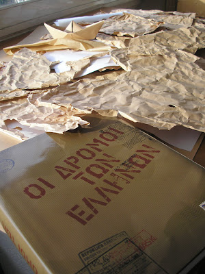
It’s a greek publication on the immigrant Greeks through out recent history. An impressive big hardcover 480pages-book, that comes in it’s own box.
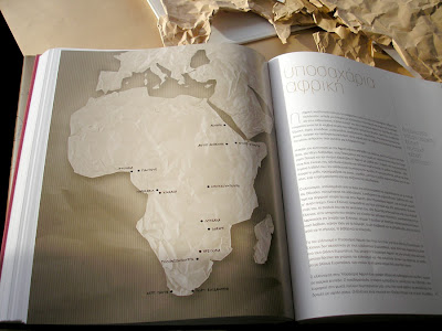
I was asked to illustrate 10 maps, one for each chapter. They made clear that the maps had absolutely no need to be too informative or even “work” as proper maps. Decorative rather than functional. I had absolute freedom.

While doodling for ideas, I was crumpling papers, as usual, tossing them around the studio. At some point, while looking at one, I realized how much crumpled paper resembles the earth’s terrain. That was it! I made this 2d paper sculpture of a map, took a photo and sent it to the editor. Fortunately they loved it. They even followed the paper concept for the cover.

When I got the actual book in my hands a couple days ago, I noticed a few things I wasn’t happy about. The maps looked a bit “over-processed”. Too much Photoshop was involved for no apparent reason. Artificial drop-shadows, flattened tones, over-exposure, and a black font instead of white handwritten text on the maps like I intended. It’s still nice, but took a lot out of the freshness and simplicity of the whole idea. Turns out, the graphic design department fiddled around with them over-zealously.

I had a good time making them despite the fact that it turned out to be way more labor intensive than I imagined. The book is hitting the shelves in the Greek market real soon from Polaris publications.


Thanx Mike. I was quite happy with the concept myself, although I wish they would have served it with a little more care.
hmm thats a pity that the graphic department did their “thing” on the photos but that what they always do.
Other than that the book looks lovely :)
good job with the concept